Power BI Design of Dashboards and Reports
The design purpose should guide the selection of which Power BI visuals to use.
-
Power BI dashboard design rules by SQLBI
-
Visual Business Intelligence for enlightening analysis and communication by Stephen Few
-
The Extreme Presentation Method by Andrew Abela is a 10-step guide to creating communications that drive action.
- The Extreme Presentation Slide Chooser This guide helps to identify the intent of the message and to choose slides accordingly. The primary choice is whether a slide is intended to explain or recommend and the secondary choice is Where, When, Who, How, What, or Why.
- The Extreme Presentation Chart Chooser is a selection guide according to the purpose of the chart visual: relationship, comparison, distribution or composition.
 (click the image to follow link)
Power BI bookmarks
Power BI visualizations by category
-
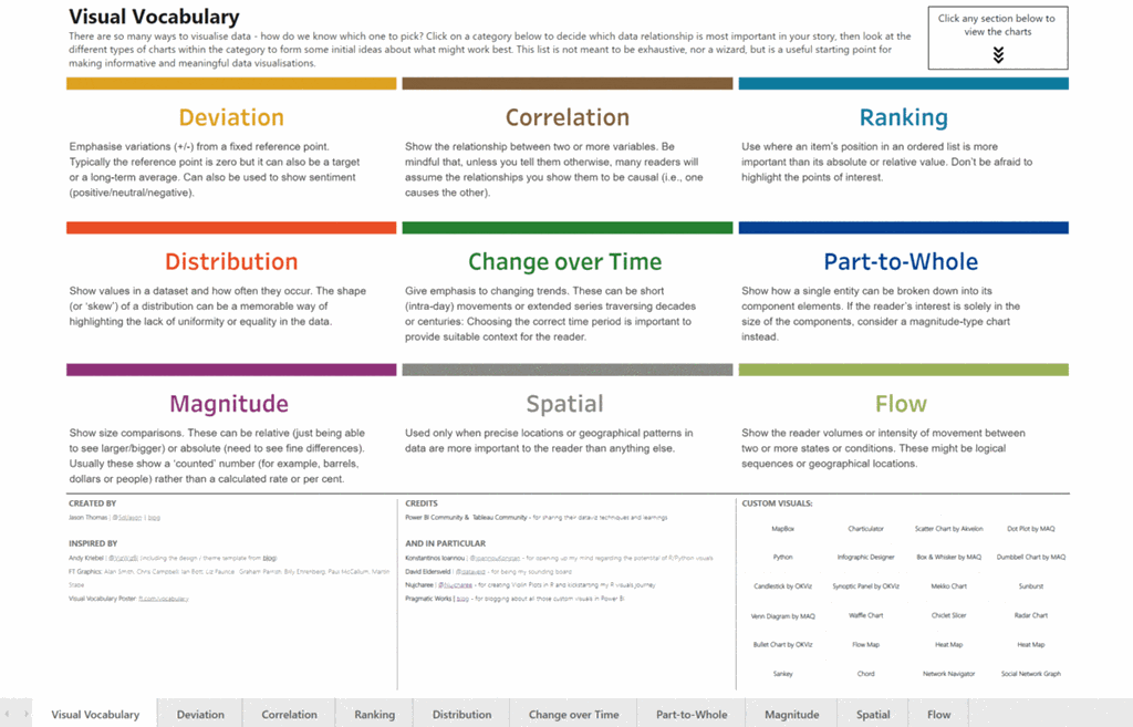
FT Chart Doctor Visual Vocabulary
- Link to full-screen PBI online version (click the image to follow link)
-
2018-10 Power BI visuals-reference-by-SQLBI
Power BI custom visuals
-
Samples on GitHub to help select Power BI custom visuals, including R-visuals
-
How to build a custom visual for Power BI by James Dale (51 mins video)

